
Why Spreadsheet Charts Deserve Better Than Excel Defaults
Every team collects data in spreadsheets at some point. Sales numbers in Excel, experiment results in Google Sheets, student grades in a shared CSV. The problem is never gathering the data — it is turning that grid of numbers into something a reader can actually absorb in seconds.
Most people reach for Excel’s built-in charts, only to discover that the default templates look dated, the formatting breaks when rows are added, and exporting a clean image for a slide deck takes far more steps than it should. Others open a design tool and spend an hour wrestling with axes and legends. Neither path respects the time of someone who just needs a quick, presentable visual.
Why Standard Chart Tools Fall Short
The core frustration is friction. Enterprise charting software demands an account, a subscription, and a learning curve that rivals the data analysis itself. Free tools often slap watermarks on every export or lock half the chart types behind a paywall. When you are preparing a one-off report or a classroom handout, those trade-offs feel disproportionate. You do not need a design suite; you need a reliable way to paste data and get a chart image back.
There is also the matter of privacy. Spreadsheets frequently contain sensitive information — quarterly revenue, client lists, research measurements. Uploading that data to a third-party server for rendering introduces a risk that many users would rather avoid entirely, especially in regulated industries or academic settings.
A Simpler Workflow: Paste, Pick, Download
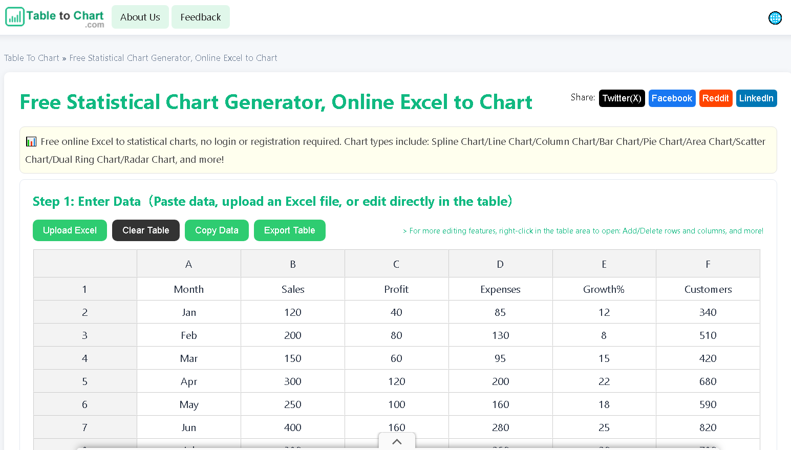
A growing category of browser-based tools tackles this by keeping every step local. The idea is straightforward: paste or upload your spreadsheet, select a chart type, and render the result without ever sending the data to a remote server. The chart is generated entirely in the browser, which means the raw numbers never leave your machine. One such tool is Table to Chart, which supports all the chart families people actually use — line, bar, pie, scatter, area, radar, and more specialized types like funnel and dual ring.
They auto-detect column headers, scale the canvas to fit the data, and export at resolutions sharp enough for print. No sign-up wall, no watermark, no hidden tier.
When Local Generation Actually Matters
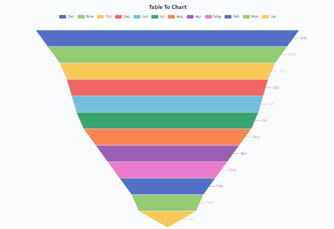
Consider a marketing team preparing a pitch deck the night before a client meeting. They have conversion funnel data in a CSV and need three charts by morning. A local browser tool lets each team member generate their own visuals without coordinating through a single licensed seat. Or think about a university researcher who needs to embed a heatmap in a paper but cannot justify uploading patient data to a cloud renderer. Browser-side generation sidesteps the compliance question entirely.
For small business owners, the benefit is speed. One chart for one slide does not warrant a Canva subscription or a Figma project. Paste the numbers, pick the type, download the image, and move on to the actual presentation.
What to Look for in a Chart Generator
When evaluating these tools, a few criteria separate the useful from the frustrating. First, check whether the tool truly runs locally — look for language about on-device rendering and no server uploads. Second, verify the export options. A chart that only saves as a low-resolution PNG is not useful for print materials. Third, confirm that the chart type menu covers your needs without upselling you to a paid tier.
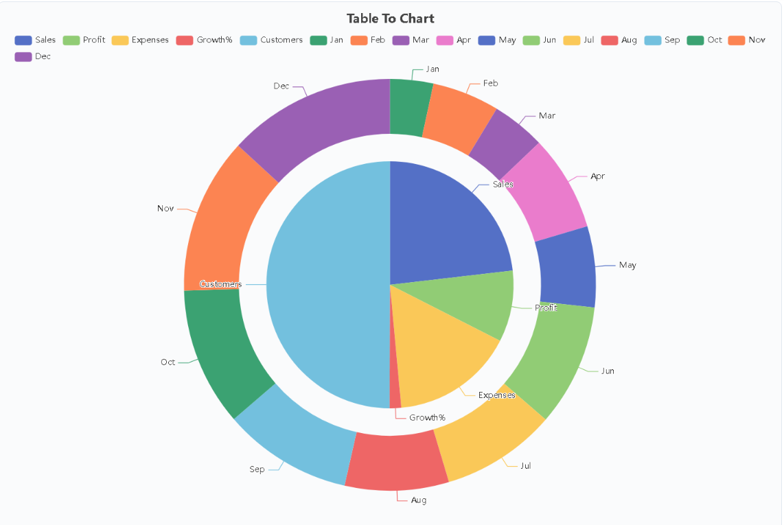
Finally, test the input flexibility. The best tools accept clipboard pastes, CSV text, and uploaded files, and they handle messy headers, merged cells, and variable row counts without crashing. If you can go from raw spreadsheet to finished chart in under a minute, the tool is doing its job.
The bottom line: you do not need expensive software or a design background to produce clean, professional charts. A well-built browser tool handles the conversion locally, respects your data privacy, and gets out of your way so you can focus on the story the numbers tell.